Home / Blog / How to Design a Business Sign That Actually Works
July 12, 2026 • 6 min readHow to Design a Business Sign That Actually Works
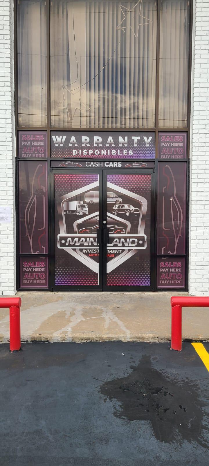
The best signs do one job well: they get read and remembered in a few seconds. Whether you’re designing a storefront sign or a monument, these principles make the difference between a sign that works and one that blends in.
1. Prioritize readability
Keep it simple. Your business name and one key message are usually enough. Avoid cramming in every service — clutter kills legibility from a distance.
2. Use strong contrast
High contrast between text and background (light on dark or dark on light) makes a sign readable day and night. Low-contrast color combos disappear at a distance.
3. Size for viewing distance and speed
A sign read by highway drivers needs much bigger letters than one for foot traffic. As a rule of thumb, bigger and bolder wins.
4. Stay on brand
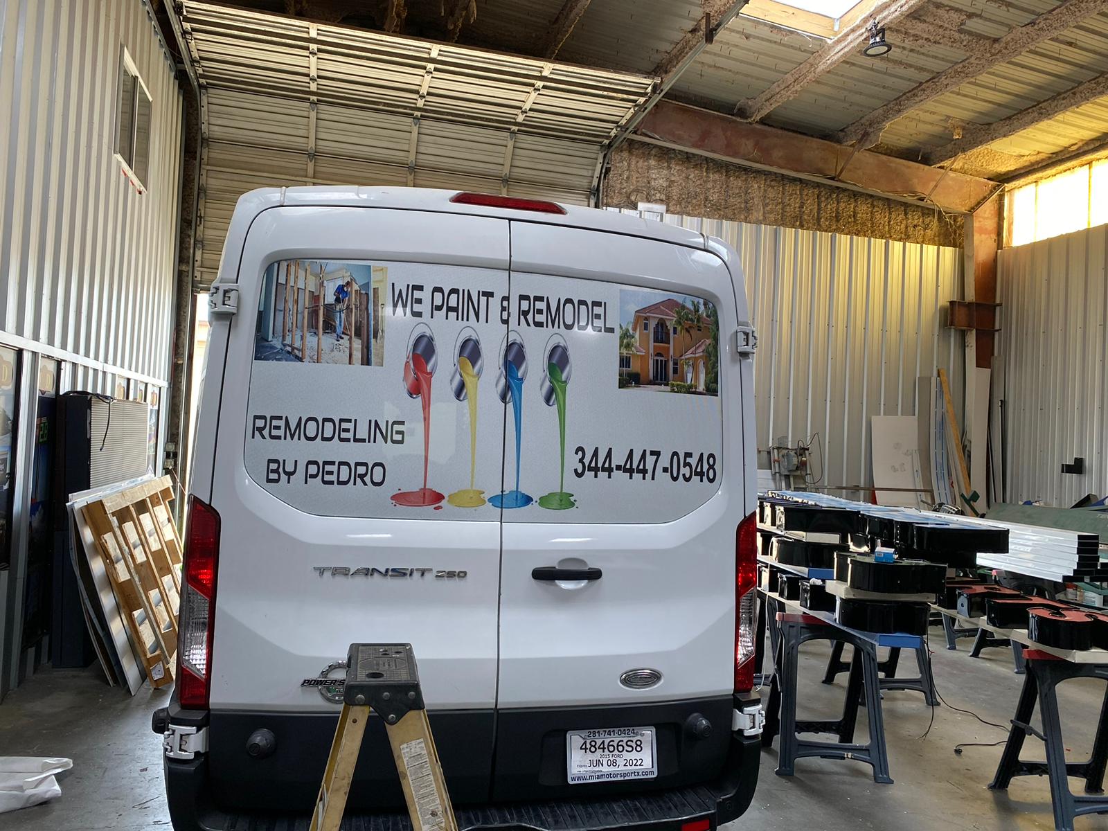
Use your real logo, brand colors, and fonts so the sign reinforces recognition across your storefront, vehicles, and interior.
5. Choose the right materials & lighting
Durable, weather-rated materials and the right illumination keep your sign looking sharp for years and visible after dark.
Let our designers help — free
Send us your logo and Sign Go’s in-house designers will create free mockups so you see it before we build it. Call 281-814-1111 or request a free quote.